

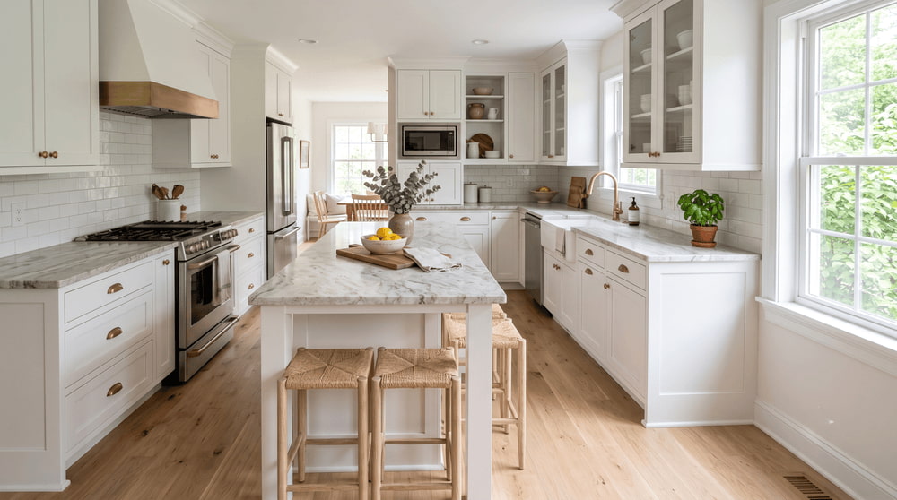
White cabinets go with almost everything. That is exactly what makes choosing a countertop so difficult.
Ask which countertops work with white cabinets, and the honest answer is that nearly all of them can. When nothing looks obviously wrong, every slab stays in consideration and the decision stalls.
The best countertops for white cabinets are not determined by one universal color or material. The right choice depends mainly on two things: whether your cabinet white is warm, cool, or neutral, and how much contrast you want between the cabinets and countertop.
Once those decisions are clear, it becomes much easier to narrow hundreds of slabs down to three or four serious options.
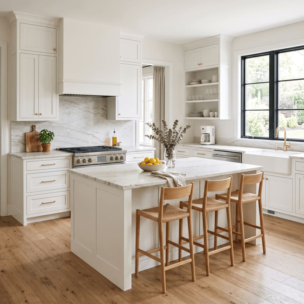
Quick Guide: What Countertops Go With White Cabinets?
| Cabinet color | Countertops that usually work best | Use carefully |
|---|---|---|
| Cool white | Cool gray, black, crisp white, blue-gray, marble-look surfaces | Cream, yellow-gold, strongly warm beige stone |
| Warm white | Cream, beige, tan, taupe, warm gold-veined stone | Stark blue-gray and icy white surfaces |
| Neutral white | Most warm and cool countertop colors | Off-whites that are only slightly different from the cabinets |
These are not absolute rules. Lighting, flooring, hardware, and backsplash choices can change how a combination feels. Still, matching undertones is the safest place to begin.
Is Your White Cabinet Color Warm, Cool, or Neutral?
This is the step most homeowners skip, and it causes many disappointing choices.
There is no single shade called white. Most white cabinets fall into three broad families.
Cool white cabinets
Cool whites lean slightly blue or gray. They tend to look crisp, modern, and architectural.
They usually pair well with cool gray stone, black granite, crisp white quartz, blue-gray surfaces, and cool marble-look patterns.
Place a strongly cream or yellow-toned granite beside a cool white cabinet, and the stone may appear more yellow than expected.
Warm white cabinets
Warm whites lean toward cream, ivory, or greige. They feel softer and often work naturally with warm wood flooring.
They usually pair well with cream, beige, tan, taupe, gold movement, warm white quartz, and warm-veined granite or quartzite.
A stark blue-gray countertop beside warm white cabinetry can make the cabinets look more yellow than they did on their own.
Neutral white cabinets
Neutral whites sit closer to the middle and are generally the most flexible.
However, a countertop that is almost the same white—but not quite—may look unintentionally mismatched. In these kitchens, either a close tonal match or a more deliberate contrast usually works better.
A Simple Way to Check Your Cabinet Undertone
Hold a clean sheet of bright white printer paper against the cabinet door.
A warm white may appear creamier or slightly yellow beside it. A cool white may appear gray or blue. A neutral white will usually look relatively similar.
This is a useful first check, but it is not a substitute for viewing the actual cabinet door beside the slab. Light bulbs, sunlight, paint finish, and even the paper can affect what you see.
Photos are less reliable because phone cameras automatically adjust exposure and white balance. Whenever possible, bring a cabinet door, drawer front, or physical paint sample when viewing countertops.
Light or Dark Countertops for White Cabinets?
Once the undertone is clear, the next major decision is contrast.
Low contrast: light countertops with white cabinets
A pale countertop can visually merge with the cabinetry, making the kitchen feel calm, bright, and open.
This direction often works well in small kitchens, narrow layouts, and rooms with limited natural light.
The main risk is flatness. When the cabinets, countertops, and backsplash are all similar, the kitchen can feel unfinished. Veining, hardware, flooring, or a contrasting backsplash can provide definition.
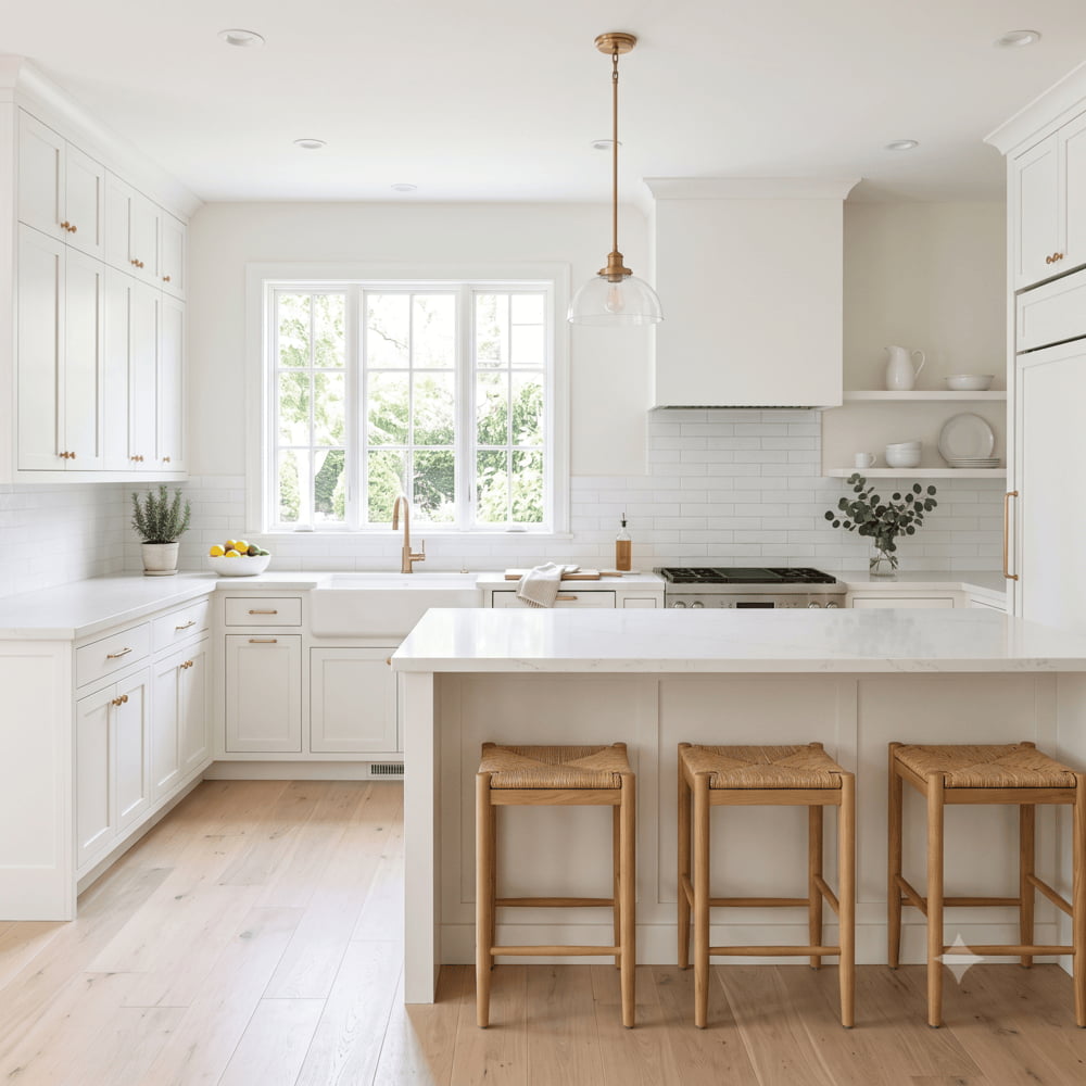
Medium contrast: light stone with visible movement
For many white-cabinet kitchens, this is the most balanced direction.
The countertop remains light enough to preserve brightness, while veining, speckling, or mineral movement gives the eye something to focus on.
It introduces character without committing the room to a very dark or dramatic palette.
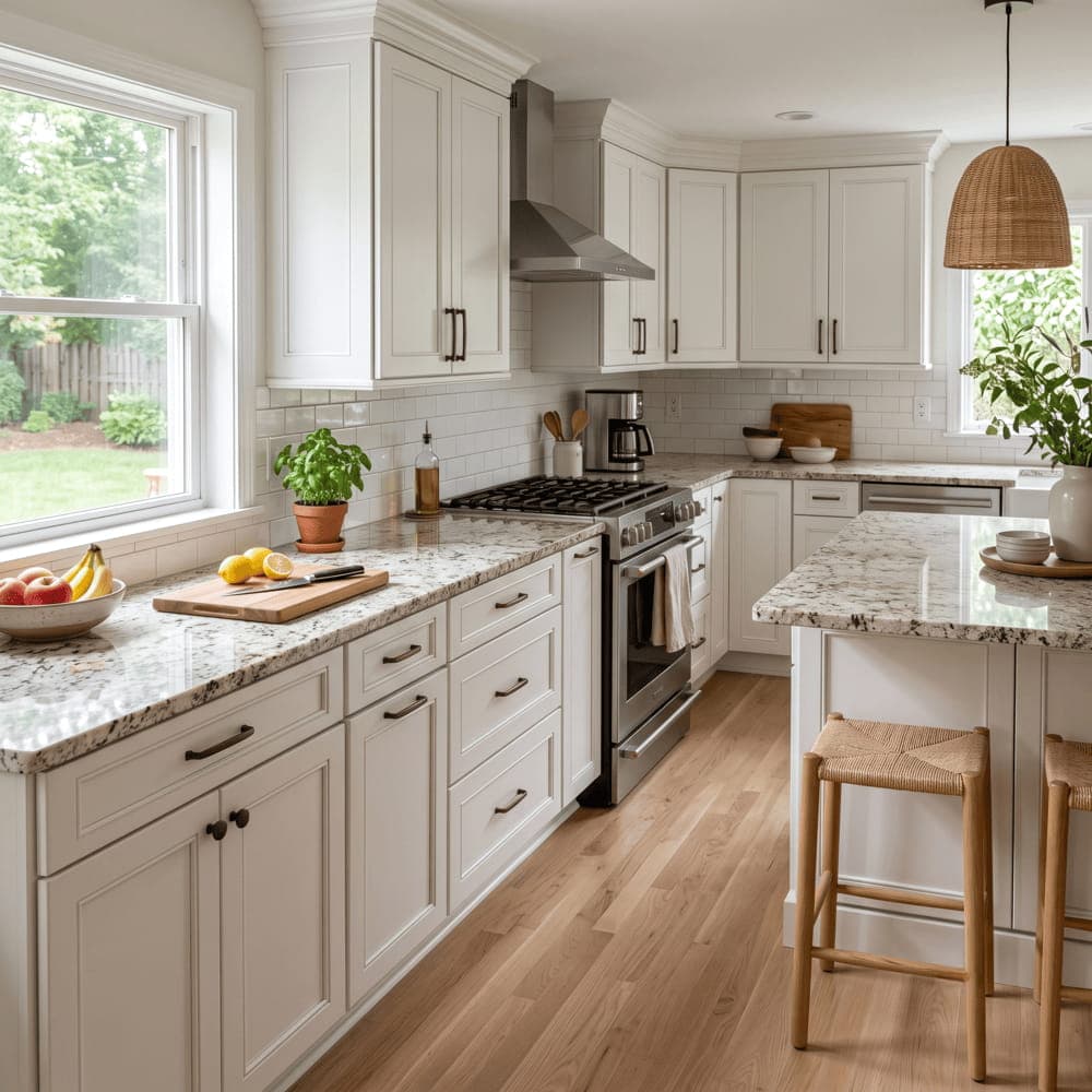
High contrast: dark countertops with white cabinets
Dark stone against white cabinets creates a strong, graphic appearance.
Black granite, charcoal quartz, and dark soapstone-style surfaces can make the cabinetry look sharper and help ground a large kitchen.
Dark polished surfaces can show dust, crumbs, fingerprints, and water spots more readily. Honed or leathered finishes can make some of these marks less noticeable.
There is no universally correct contrast level. Choosing one before looking at slabs can eliminate a large portion of the options immediately.
Best Countertop Colors for White Cabinets
Light stone with soft movement
Light stone with subtle veining or fine mineral detail is one of the safest and most versatile choices.
Look for soft gray veining with cool white cabinets, beige or gold movement with warm white cabinets, and balanced gray-beige movement with neutral whites.
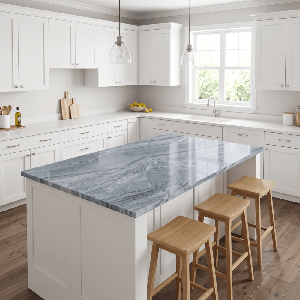
Dramatically veined stone
Bold veining works well when the countertop is intended to become the main visual feature.
White cabinetry acts as a clean frame, allowing the stone to take center stage. This is especially effective on large kitchen islands.
Quartzite is a common choice for this look. Marble can also create exceptional movement, but it requires greater acceptance of etching, staining risk, and maintenance.
With dramatic stone, viewing the full slab is essential. A small sample cannot show where the strongest veins fall.
Warm beige, cream, and gold tones
Warm neutral countertops create a softer atmosphere than crisp white or cool gray surfaces.
They pair especially well with warm white cabinets, white oak flooring, brass or bronze hardware, and cream-colored backsplashes.
Against a very cool white, strong yellow or gold tones may feel disconnected.
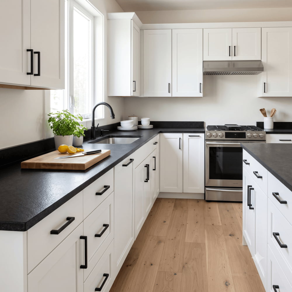
Deep black and charcoal
Black countertops with white cabinets remain a classic combination.
They create clear definition and work especially well with matte black hardware, black-framed windows, white tile, and light wood flooring.
A leathered black granite provides a softer, more textured alternative to highly polished black stone.
Cool gray
Cool gray countertops create a quiet, modern look and are usually easiest to coordinate with cool or neutral white cabinets.
With creamy cabinetry, an icy gray surface can exaggerate the cabinet’s yellow undertone. The combination can still work, but the flooring, wall color, and backsplash need to support it.
Blue or green natural stone
White cabinets also provide a clean background for blue, blue-gray, and green-toned stones.
These choices can create a distinctive kitchen but may influence future paint, flooring, and décor decisions. Always view strongly colored stone at full slab size before committing.
How Chicago’s Natural Light Changes Countertop Color
Lighting affects every countertop, but it becomes particularly important in Chicago kitchens.
During much of late fall and winter, homes receive cooler, flatter natural light. A combination that looks crisp in a brightly lit showroom may feel colder in a north-facing kitchen during winter.
Cool white cabinets with a cool gray countertop may look sharp under bright showroom lighting. In a north-facing Lakeview kitchen on an overcast February day, the same combination can appear flatter and grayer.
Cool palettes can still work, but they should be evaluated under realistic conditions.
North-facing kitchens usually receive cooler indirect light. South-facing kitchens get warmer daylight. East- and west-facing rooms change more noticeably throughout the day.
Do not judge a stone only under the most flattering showroom light. Ask to see it in a less brightly lit area or near a window on an overcast day. For kitchens that remain cool or dark for much of the year, a stone with warm minerals or a slightly warmer background can help balance the room.
Two Mistakes to Avoid
Choosing from a small sample
A four-inch sample can show the general color family, but it cannot show where the movement is concentrated, how the background changes, or how seams may interrupt the pattern.
Use samples to narrow the category. Use the full slab to make the final decision.
Choosing the backsplash last
The countertop and backsplash form one visual field.
Selecting the countertop in isolation can produce two materials that look attractive separately but conflict when installed together.
Bring backsplash samples when viewing slabs, or consider a full-height backsplash made from the countertop material. The backsplash does not have to match the counter, but it should relate to it intentionally.
How Flooring and Hardware Affect the Countertop
The countertop is only one of the major surfaces in the kitchen.
Brass and bronze can reinforce cream, tan, and gold-veined stone. Matte black, chrome, and stainless steel often sit comfortably with gray, black, and crisp white surfaces.
Flooring is even more influential because it covers such a large area. Warm white oak floors can pull the entire room in a warmer direction, even when the cabinets are neutral.
When the cabinets, countertop, floor, and backsplash share a compatible visual temperature, the kitchen usually feels coordinated. When one surface strongly disagrees, the room can feel slightly off even when each material looks good on its own.
Best Countertop Materials for White Cabinets
Color and contrast determine the appearance. Material determines how the countertop performs in daily use.
Granite
Granite offers a broad range of colors, mineral patterns, and price points. It provides strong heat resistance, natural variation, and many warm, cool, and neutral options.
Some granite countertops require periodic sealing, depending on the stone’s porosity and the sealer used.
Quartzite
Quartzite provides the depth of natural stone and often offers better resistance to scratching and etching than marble.
It is commonly chosen for bold veining and large islands. Not every slab sold as quartzite performs identically, so ask about the specific stone and recommended maintenance.
Quartz
Quartz provides consistent color and pattern with no routine sealing requirement.
It is reliable when you want predictable color or a controlled marble-look pattern. Heat is its main limitation, so hot pans should not be placed directly on the surface.
Porcelain
Porcelain is non-porous, UV-stable, and highly heat-resistant.
Its large-format availability makes it effective for full-height backsplashes, waterfall islands, and thin-profile designs. Experienced fabrication is especially important around edges and cutouts.
Marble
Marble offers depth and movement that engineered imitations do not fully reproduce.
It also requires acceptance of etching, patina, possible staining, and more careful daily use. For homeowners who want the surface to remain visually unchanged, quartz or quartzite may be a better fit.
Frequently Asked Questions
What is the most popular countertop look for white cabinets?
Light stone with soft gray, beige, or warm movement is one of the most versatile directions. It keeps the kitchen bright while adding enough pattern to avoid flatness.
Should countertops be lighter or darker than white cabinets?
Either can work. Light countertops feel calm and open, while dark countertops create stronger definition. Undertone compatibility is more important than whether the counter is lighter or darker.
Do white countertops with white cabinets look too plain?
They can if every surface has the same tone and very little movement. Veining, contrasting hardware, wood flooring, or a distinctive backsplash can add definition.
What countertop makes a small white kitchen look larger?
Light stone with low contrast, minimal visible seams, and a simple backsplash can make a small kitchen feel more open.
Should the island countertop match the perimeter countertops?
It does not have to. A contrasting island can add focus, but the two materials should share a connecting element such as undertone, veining color, or visual temperature.
Bring the Cabinet Door
There is a version of this decision that happens on a screen, and another that happens with a cabinet door in one hand and a full slab in front of you.
Only one is reliable.
Photos shift colors, flatten movement, and cannot show how a stone will react to the specific light in your kitchen.
Bring your cabinet door or drawer front to our Bensenville showroom. If the cabinets have not been built yet, bring the exact paint name and a physical paint sample. A backsplash sample, flooring sample, and kitchen layout are also helpful.
We can narrow the inventory to slabs that fit your cabinet undertone, compare them at full size, and identify which stones support the room rather than fight it.
Call (773) 632-1600 or make an appointment.
Come with the cabinet door. Leave having seen the slab beside it.
2 Responses
[…] or off-white cabinets: The classic high-contrast combination. See our countertops for white cabinets guide for more […]
[…] give you the most flexibility, but that can also make narrowing down the options difficult. Our guide to countertops for white cabinets can help you compare different […]